Monday, July 21, 2014

Color me Happy: before and after

Almost a year in planning and production this kitchen/family room/ dining is everything we asked for....and more. The original kitchen had 8 ft ceilings while the rest of the space was a cathedral ceiling that went to 14 ft. The original space was small with a breakfast nook that wasn't being used. On the opposite side of room was the dining room. My pet peeve, two tables that are close to each other, one never really gets used.
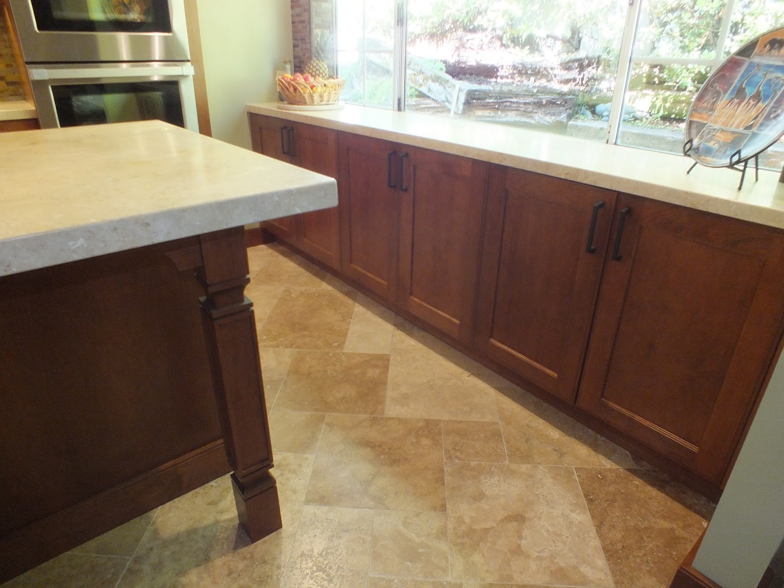
     First thing I redesigned was the floor plan to allow room to function as a great room. We took down the solid wall and replaced it with an peninsula. The overhang on peninsula now allows you to sit and watch the cook ! As well as opening up the family room side to the kitchen. Dining room still has a sense of privacy but with the wall opened up on that side, too. A higher counter was added and it also creates a buffet serving place between dining and kitchen. What was the breakfast nook is now where we moved the cooktop. The flow has gone from cramped to expansive.
     The surprise was the colors. I have to give it to my clients to be brave enough to create the color scheme so richly. I suggested a white, yellow and blue scheme but they took it and ran with it. The results are striking. Bold and beautiful, most unique.
BEFORE, FROM DINING ROOM SIDE

AFTER FROM DINING ROOM SIDE

BEFORE, IN THE BREAKFAST NOOK

BEFORE, FROM THE BREAKFAST NOOK

AFTER, BUFFET AREA AT DINING ROOM

SINK AREA. COLOR SCHEME OF WHITE, BLUE, YELLOW ALL COMES TOGETHER. 

BEFORE, ODD CEILING TRAY, DUST AND KITE COLLECTOR

BEFORE, WALL TO RIGHT PARTIALLY REMOVED, BECAME PENINSULA. 

AFTER, 18 X 18 PORCELAIN TILE IN ORANGE/YELLOW STARTED COLOR SCHEME  OFF. 

Friday, March 14, 2014

All Good Things.......

The before kitchen was ready for a redo in the worst way. Biggest sin was the cooktop on the peninsula. That was valuable prep space. It's also the area where everyone gravitates to. Nothing worst than having to dodge the cooktop with the mail, homework etc.
BEFORE        White laminate cabinets, came with the home.

BEFORE                   Way to wide of wall cabinet doors, awkward looking. Black appliances stick out in all their glory !

BEFORE                      Tile countertops , lots of grout lines, hard to work on, too.

BEFORE           This area not really used for prep, wasted valuable space.

AFTER   Wow, what a change, so soothing, so sophisticated . Cooktop gone, prep space now added.

AFTER    Dacor range, now this area gets used.

AFTER      Clean sweep of counter tops. Wall cabinet doors a manageable size and a glass door to break it up.

AFTER      Love that granite !

Tuesday, June 4, 2013

The talented artisan's home before and after, side by side

AFTER, outside corner


Before, outside corner
AFTER, outside corner

AFTER< large island replaces breakfast table

BEFORE, breakfast table was replaced by large island

BEFORE, refrigerator up against the wall

After, refrigerator moved to center, pantries refinished and reused.

Before, sink with trash compactor


AFTER, sink with recycle unit

BEFORE, outside corner

AFTER, outside corner

The talented artisan's home .... AFTER

The original kitchen was quite small and the family large. The breakfast nook was next to the dining room causing two tables to be almost side by side. A small opening into the family room wasn't letting the space become a "great" room.
Well, take down a couple of walls and you have a something to work with. The breakfast nook is now a long island that cements the baking area and creates a larger kitchen. With a prep sink added to the long island it now allows interaction between family room and kitchen. Small island serves as a needed landing/prep area for the refrigerator and main sink. Storage and function are improved in the new kitchen. See before and after blog for photos. Contractor Aaron Chapman Builders for cabinet install. M&amp;S Granite for countertops, Czyz's Appliance (David). Homeowner for tile install with design help from Callahan's. Design and Bellmont 1600 cabinets from Reginato Designs. Cherry with a "Bourbon" finish on cabinets. Limestone Jerusalem beige on counter tops.


The talented artisan's home ..... BEFORE

The problem with the old kitchen was that it was small and lacked storage. By taking down the wall/hanging cabinets between dining room and breakfast nook we were able to change the floor plan's traffic flow. A large island took the space where a breakfast table had been and we removed the bench , nice as it was, it didn't fit new storage plans. We wrapped the cabinets around an outside corner and put the double ovens there creating a " baking center" We saved two good tall pantry cabinets, refinished and incorporated into new design. By having a color scheme that blended cherry with maple they look at home. Glass door cabinets have a natural birch interior that also reinforces the color scheme as well as a dash of maple in the trim.  Flooring was removed and travertine tile that blends with family room was installed ( by homeowner no less ). Small prep sink was moved to larger of two islands, completing the "baking center" Large island has table details and overhang for seating. The new travertine  floor is heated and so is the large island counter top. Nothing more uncomfortable than leaning on cold stone on a winters day!