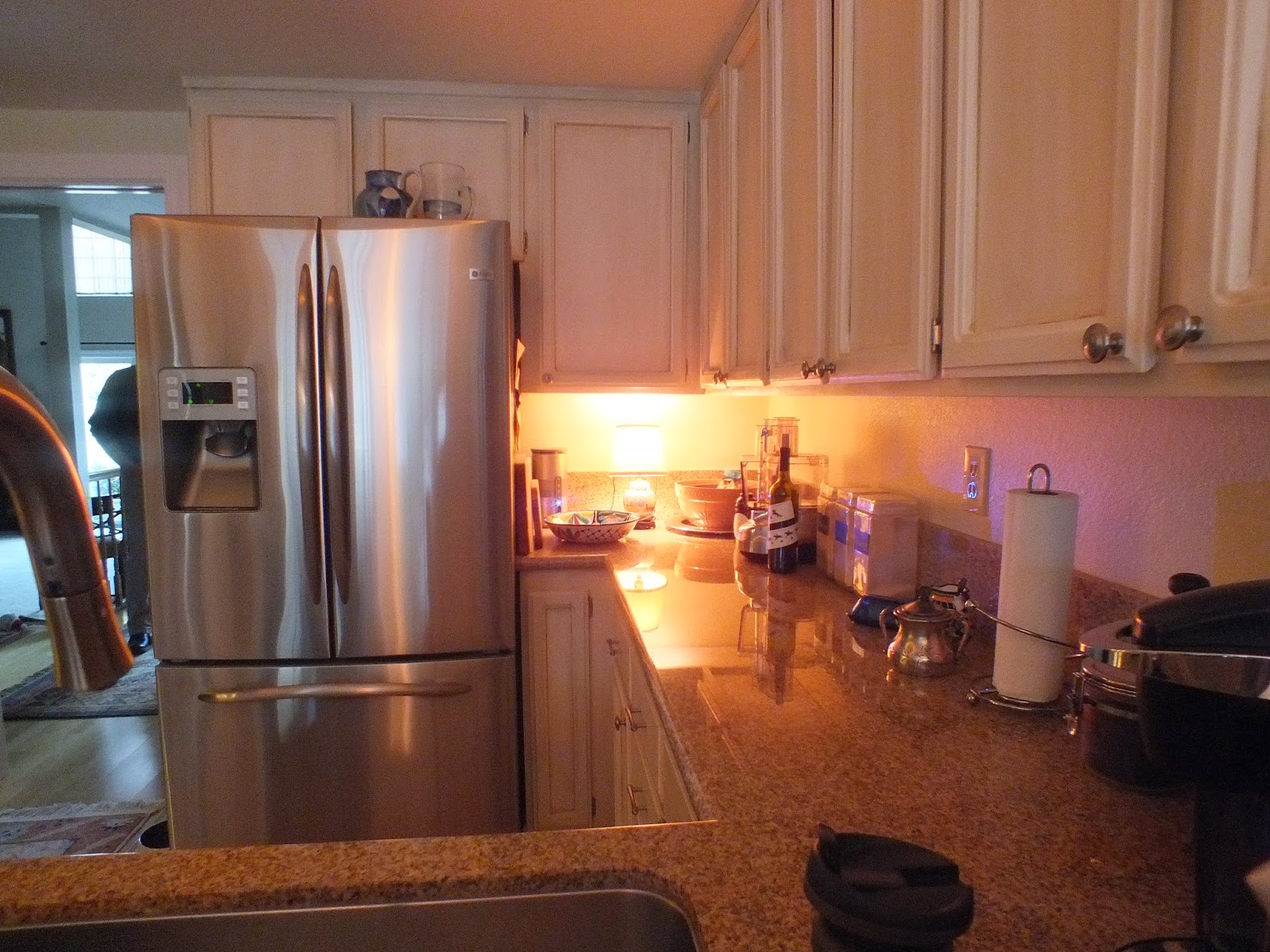
Almost a year in planning and production this kitchen/family room/ dining is everything we asked for....and more. The original kitchen had 8 ft ceilings while the rest of the space was a cathedral ceiling that went to 14 ft. The original space was small with a breakfast nook that wasn't being used. On the opposite side of room was the dining room. My pet peeve, two tables that are close to each other, one never really gets used.
First thing I redesigned was the floor plan to allow room to function as a great room. We took down the solid wall and replaced it with an peninsula. The overhang on peninsula now allows you to sit and watch the cook ! As well as opening up the family room side to the kitchen. Dining room still has a sense of privacy but with the wall opened up on that side, too. A higher counter was added and it also creates a buffet serving place between dining and kitchen. What was the breakfast nook is now where we moved the cooktop. The flow has gone from cramped to expansive.
The surprise was the colors. I have to give it to my clients to be brave enough to create the color scheme so richly. I suggested a white, yellow and blue scheme but they took it and ran with it. The results are striking. Bold and beautiful, most unique.
 |
| BEFORE, FROM DINING ROOM SIDE |
 |
| AFTER FROM DINING ROOM SIDE |
 |
| BEFORE, IN THE BREAKFAST NOOK |
 |
| BEFORE, FROM THE BREAKFAST NOOK |
 |
| AFTER, BUFFET AREA AT DINING ROOM |
 |
| SINK AREA. COLOR SCHEME OF WHITE, BLUE, YELLOW ALL COMES TOGETHER. |
 |
| BEFORE, ODD CEILING TRAY, DUST AND KITE COLLECTOR |
 |
| BEFORE, WALL TO RIGHT PARTIALLY REMOVED, BECAME PENINSULA. |
 |
| AFTER, 18 X 18 PORCELAIN TILE IN ORANGE/YELLOW STARTED COLOR SCHEME OFF. |


